Réseau Femmes Artisanes

Moroccan ‘vernacular’ aesthetics

About the project

Title: Réseau Femmes Artisanes
Type of work: Graphic design / branding and cultural studies
Date: October 2012 - January 2013
Extent of the project: 10 weeks, full-time

Réseau Femmes Artisanes is a network of women working with handicraft in Marrakech and its outskirts, for whom I designed a new visual identity. This project — part graphic design and part cultural studies — revolves around Moroccan graphic design and how visual languages and aesthetic traditions are culturally conditioned. My cultural studies and visual research of Morocco’s non-Western aesthetics laid the foundation for a visual cross-cultural design. As part of the project, I facilitated two workshops with representatives from Réseau Femmes Artisanes, drawing on co-design and human-centered design dialogue tools.

The design

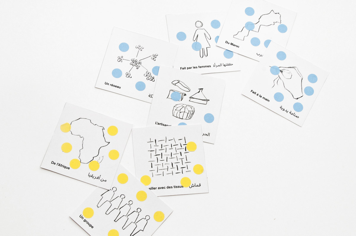
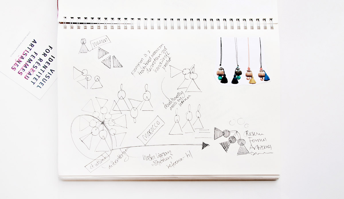
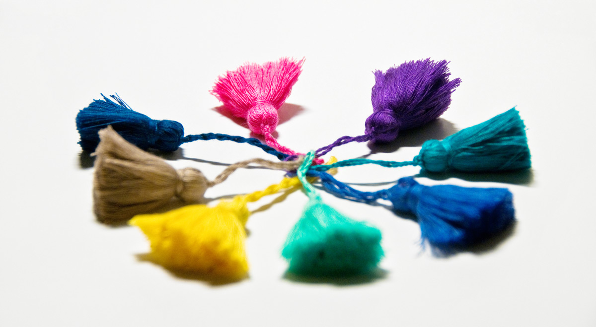
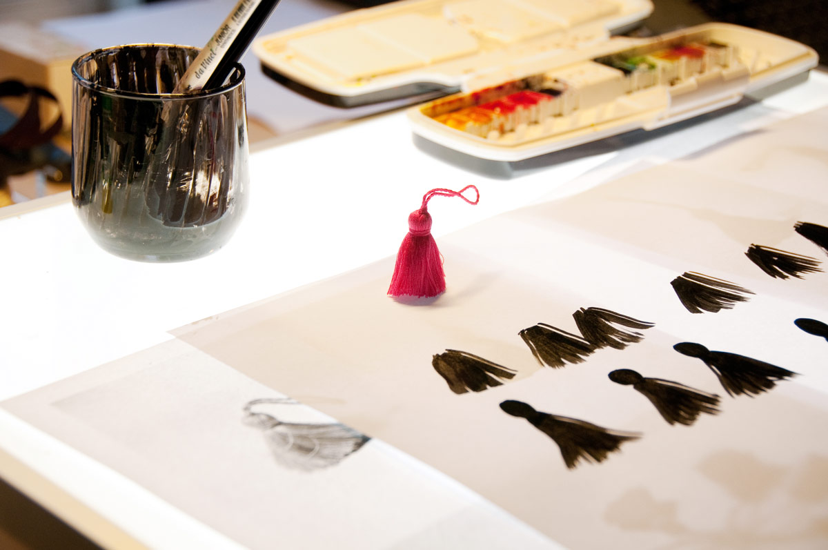
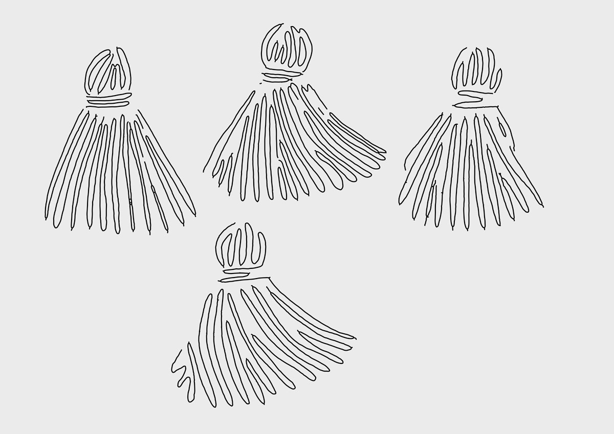
The final design is bilingual, and a combination of Western and Moroccan aesthetics in a cross-cultural visual language. The pompon resembles the stature of a woman, and refers to traditional Moroccan handicrafts as well as most of Réseau Femmes Artisanes’ products.

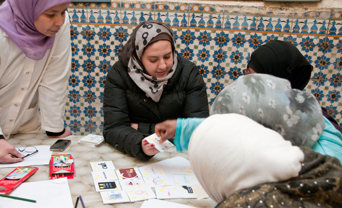
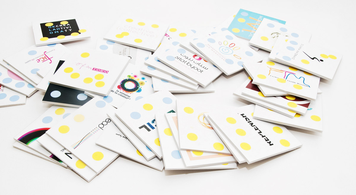
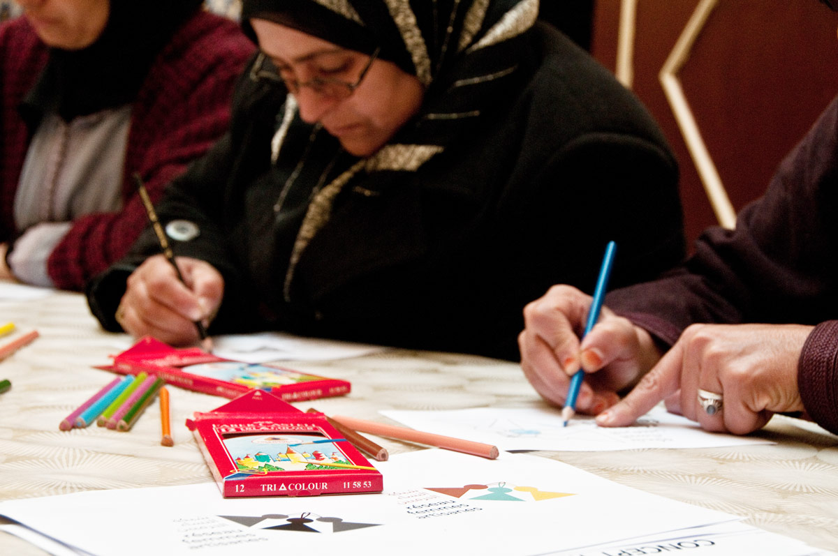
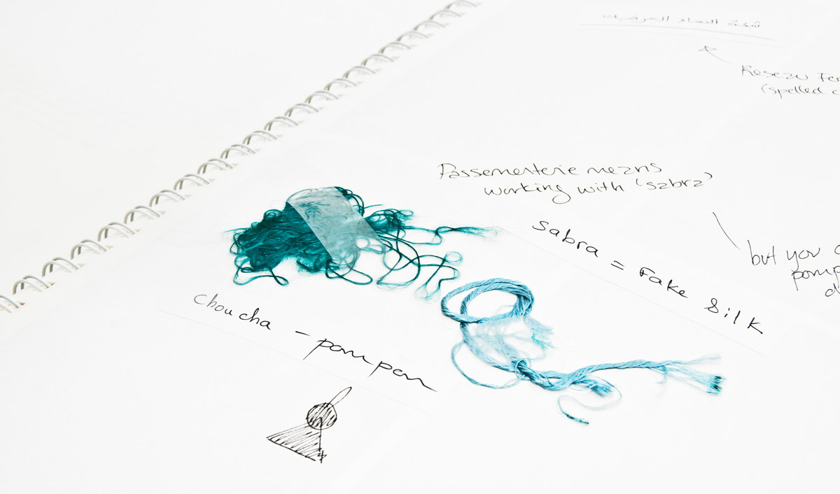
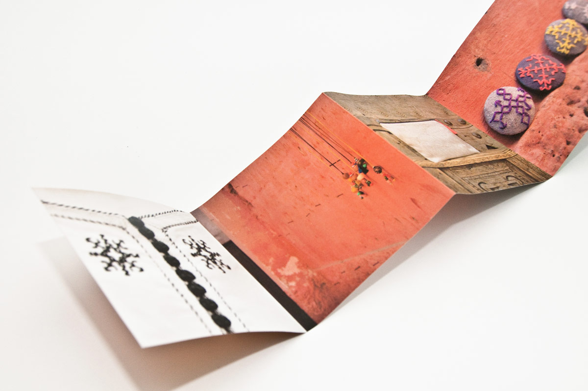
To get closer to the predominant aesthetic sense in Morocco, I researched and studied first-hand Moroccan and Arabic design characteristics. This was part of the design itself. The outcome of the visual research — consisting of photographic observations, notes from conversations with Moroccan artisans as well as historical research — is a series of small, unpretentious booklets.

Print advertisement

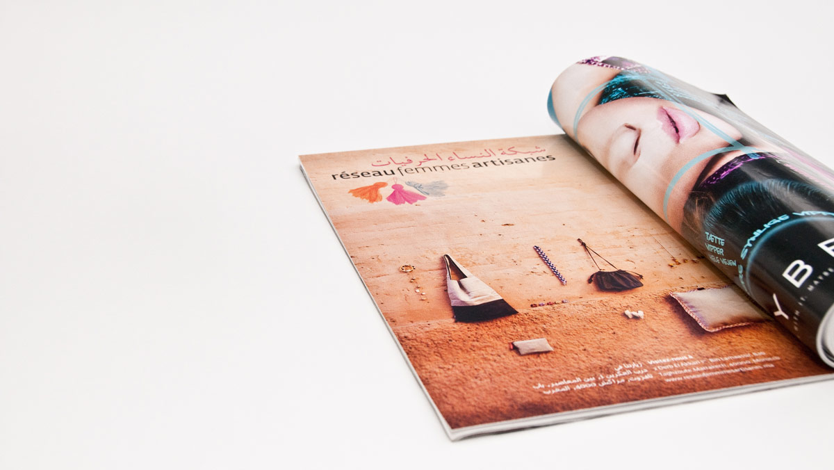
Example of a printed ad with their products in focus in a Moroccan context (a 'classic' Marrakech wall).

Business cards

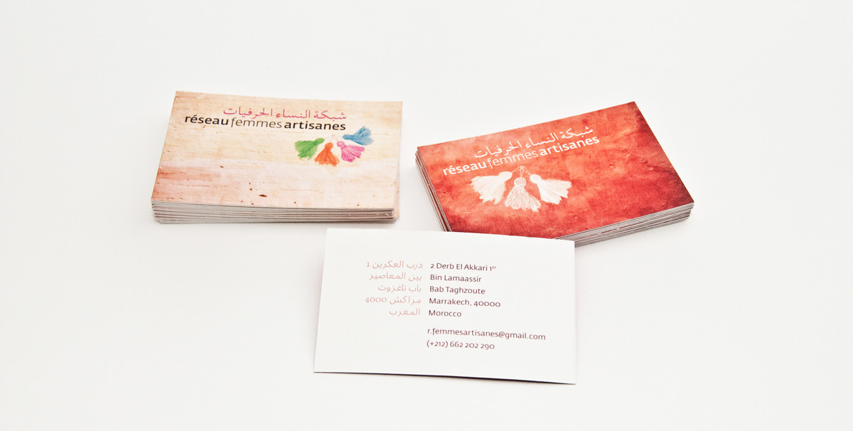
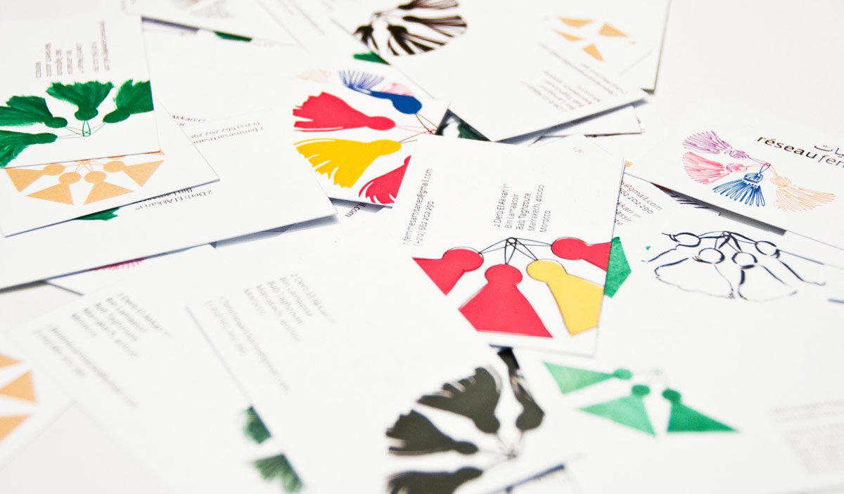
Business cards for the network in two different styles.

Folder

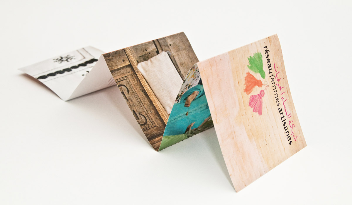
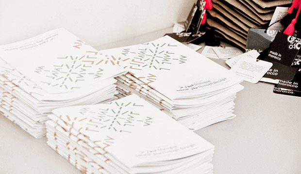
A small folder for hotels, partners etc.

Folder Price tags

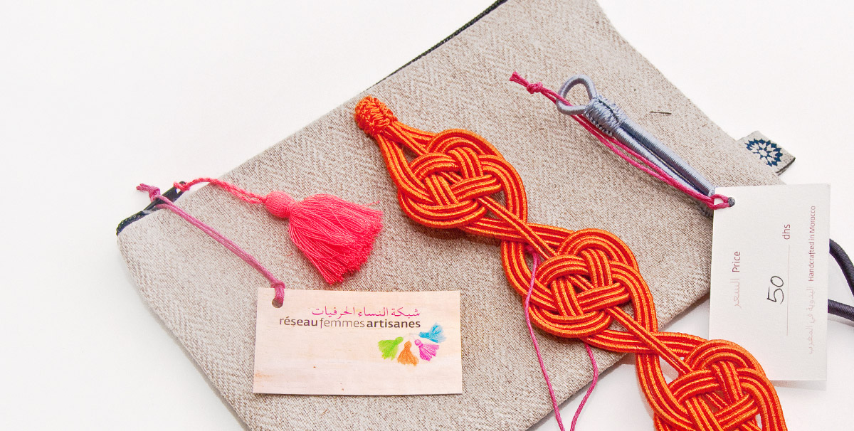
Price tags for their different products.

Website on screen

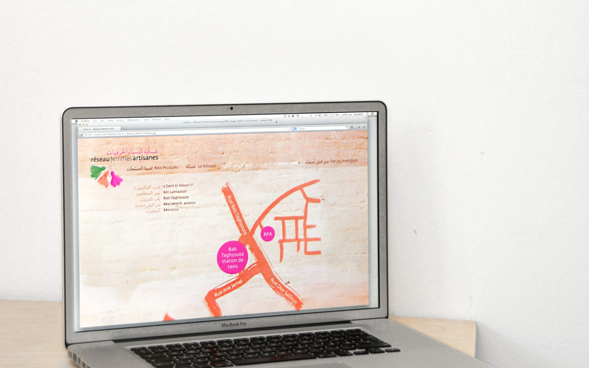
Furthermore, I designed a visual concept for the website; how it could look and work.

Website front

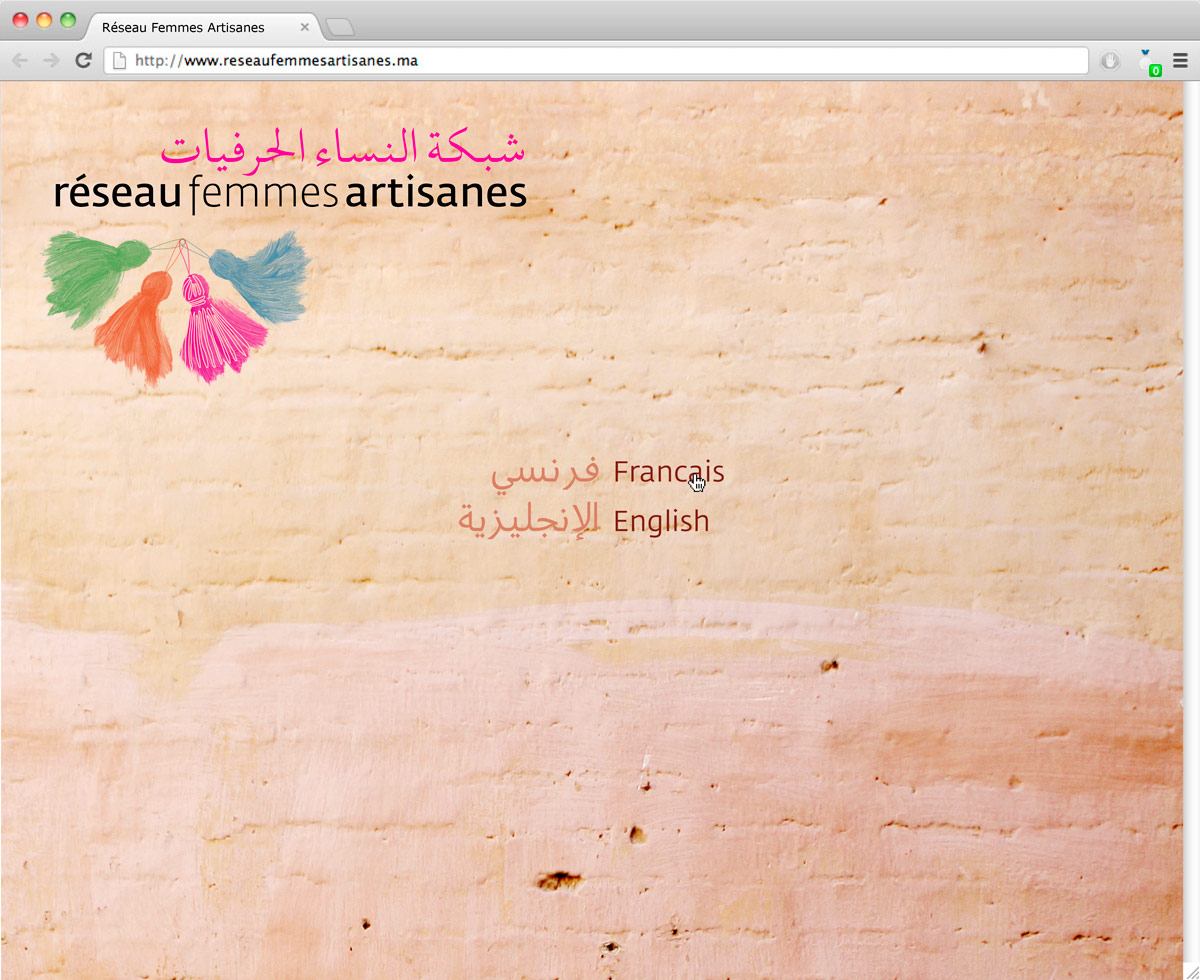
When entering the website, choosing your language is important. The arabic is always present, but the language it mirrors itself against has to be chosen.

Wbsite products

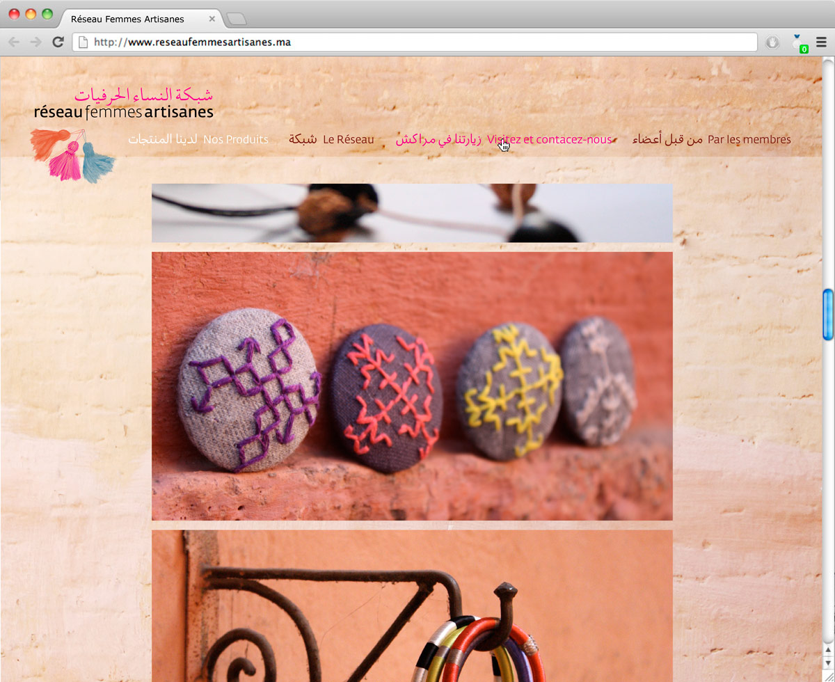
The women's products (photographed in a local context) are kept in focus.

Getting there

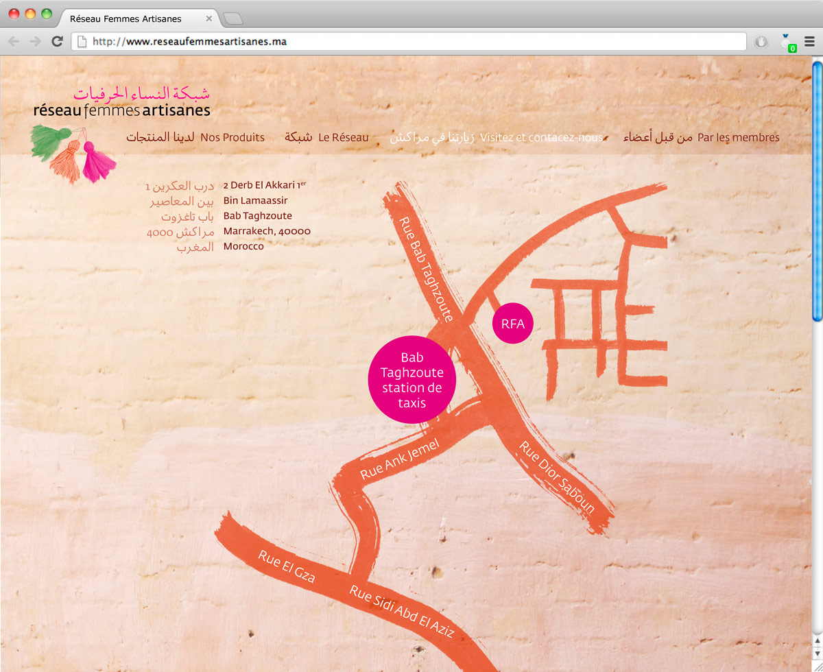
The graphics mirrors the handmade feel of the products as well as the city of Marrakech.

Cultural study booklets

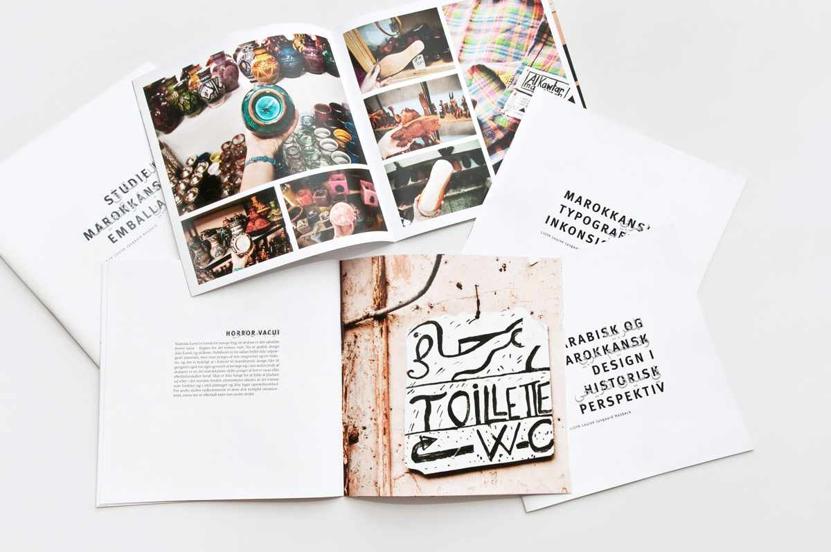
The cultural study booklets on Arabic and Moroccan design history, typographic observations, Moroccan packaging, and observations of the use of signage, as well as branding and logos in the souq.

Colourful

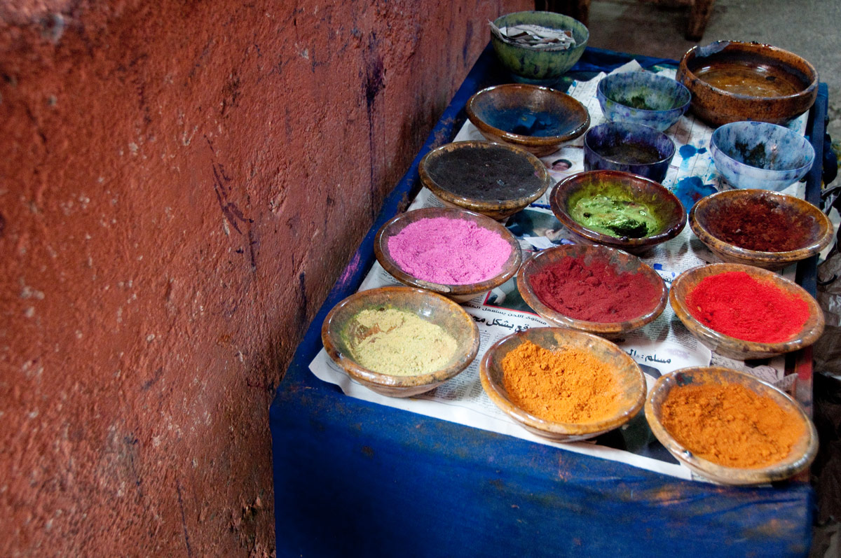
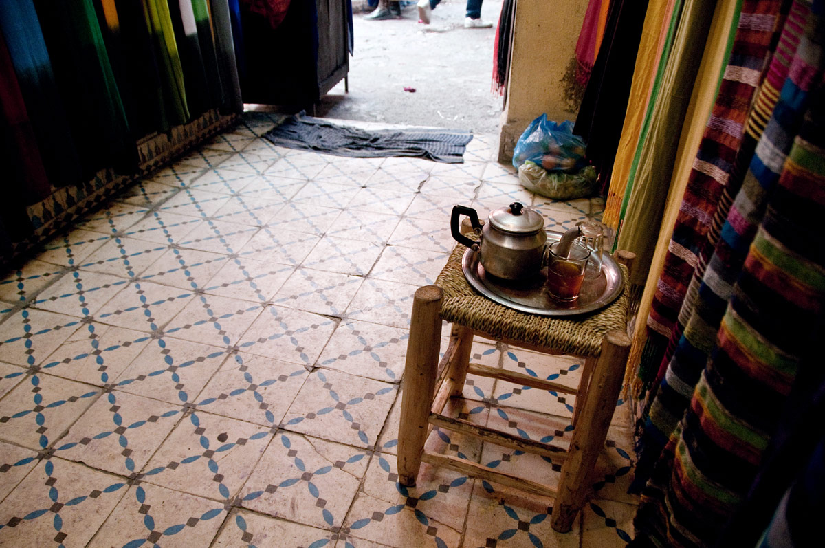
One thing very characteric to life in Marrakech is the use of colours.

Simple sign

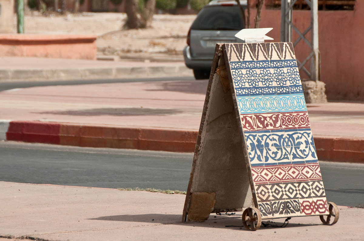
'Show, don't tell' is often true for many signs in Marrakech, partly because of the language barriers. The level of 'visual abstractness' is not as high as most of us are used to; yet the creativity to avoid using words is higher.

Key sign

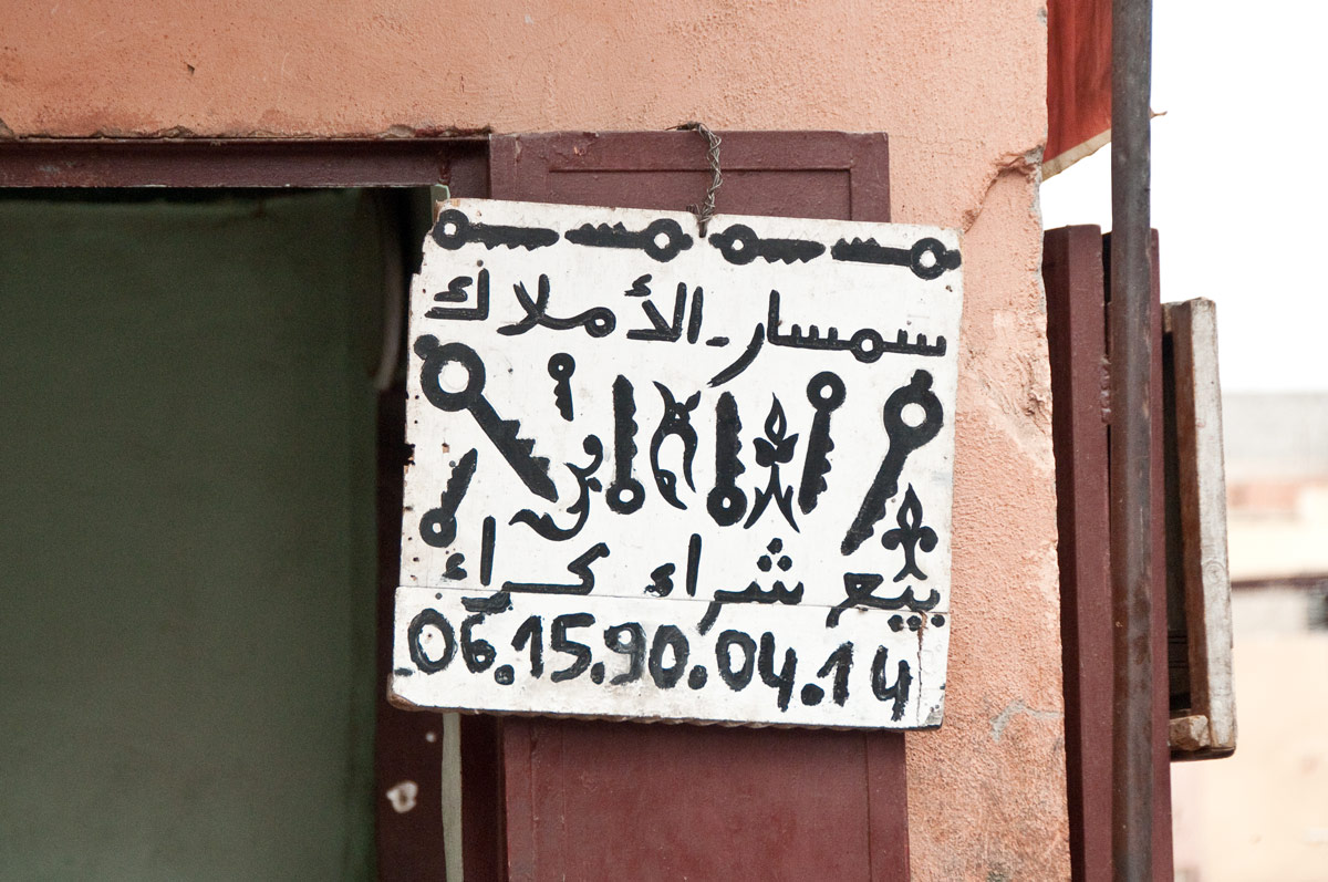
The tactility and tangibility of signage, and communication (not to mention life) in general is key to the feel of Marrakech.

Handicap sign

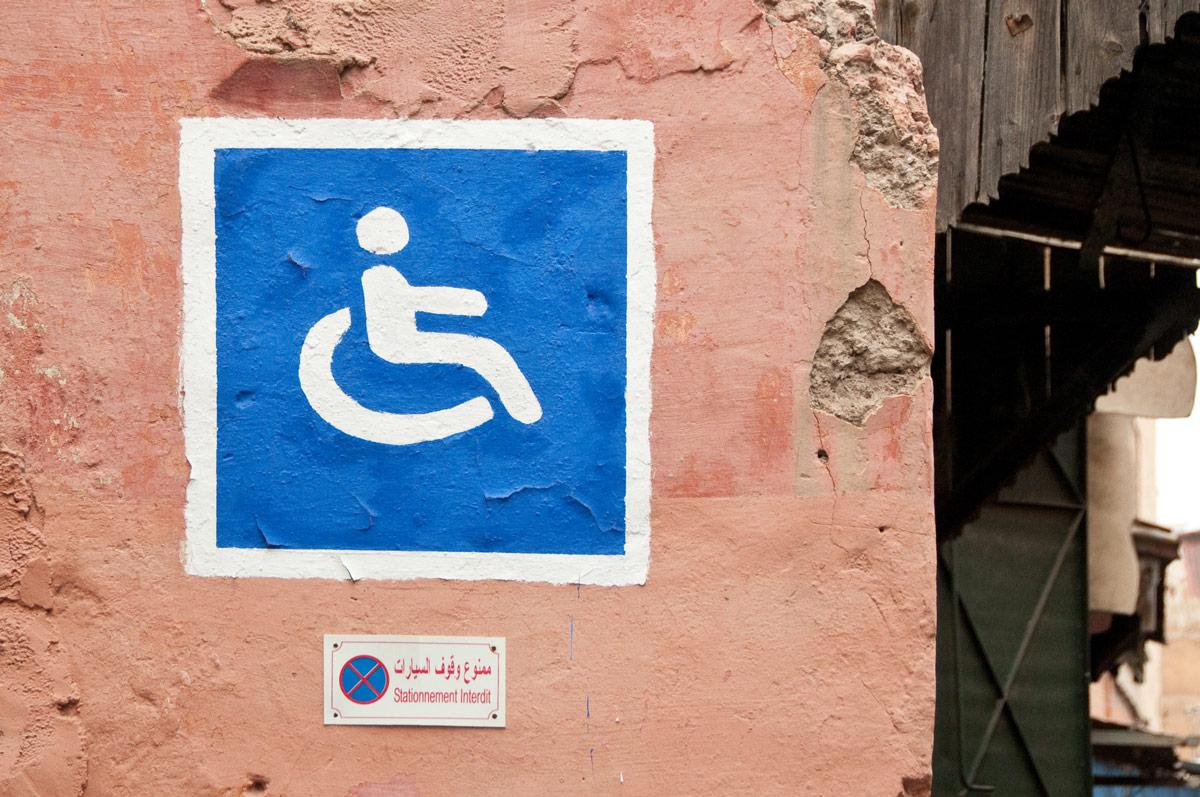
Even official signs are handpainted.

A glimpse of the process

With the aim of understanding the women and their ideas of aesthetics and self-identity, I held two workshops in Marrakech. During these workshops, a series of questions were discussed with the help of different types of workshop cards and a ‘rating’ system that helped overcome the language and communication barriers. It was important that the women could see themselves mirrored in the new identity. The concept with pompons as a symbol of a group of handicraft women was chosen — by them. I sketched and experimented visually with different ways of illustrating the pompon to find the right balance of Moroccan aesthetics with a Western touch.

Come in for a cup of mint tea

As part of the research, I wandered around and found myself invited for tea to have a chat with some of the shop owners.

Workshop with the women

As part of the workshop with the women from the network, I explored their aesthetic preferences and their reasoning behind their choices.

Workshop material

Some of the workshop materials used; this one for logos aesthetics and communication.

Workshop material

Another dialogue tool to evoke a debate about what aspects of their products and the réseau that they found most important.

Workshop drawing

I also explored which colours they would match with the réseau, and why.

Sabra

As I spent time with the women, I found myself intrigued by the meaning of the words and materials, particularly the ones related to the pom-pom.

Sketches

Initial sketches for the identity.

Pom-poms

As the concept had been decided upon (by the representatives from the network), I started to delve into the pom-pom.

Painting the pom-pom

I experimented with different ways of illustrating the pom-pom; both alone and together.

One-line pom-pom

An example from my exploration of the pom-pom's 'personalities'.

Sketches for business cards